
Each morning as Elliott Bay becomes audible, resonating with the sounds of seagulls, cargo ships, ferry horns, and the occasional whale pod, hundreds of suburban commuters take part in
User experience expert, Kelly Franznick, the Chief Innovation Officer and Co-Founder of Blink, is among the island seafarers. Kelly’s award-winning research, design and UX/UI headquarters overlooks this scenic commute from its offices in the Waterfront Place building on Western Avenue in Seattle, just a few steps away from the Colman Dock.
Before boarding the ferries, the vehicles line up for the Sound crossing like planes on a runway where they are politely sniffed by diligent K-9’s weaving through the cars with their police handlers in tow. The wheeled procession then enters the mouth of the vessels, two-astride, directed to either an outside berth with a view of the water, the cityscape of Seattle, and the Cascade mountains beyond, or in the ferry’s main compartment, the “belly of the beast.”

An announcement rings out over the loudspeakers explaining the safety procedures after three blasts of the ship’s horns followed by the ship’s whistle. Up on top, on the crowded passenger decks, there are tables and booths to slide into, padded bench seats and captain’s chairs, vending machines, brochure racks

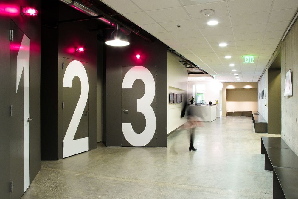
Blink offices.
If there is a more multi-sensory, multimedia, user experience it would be hard to imagine. But imagine we must. Why did today’s passengers choose this particular, 35-minute departure? What was their impression of the trip? Did the ferry leave and arrive on time? Were drivers anxious about being sniffed by a K-9? Were the safety instructions clear?
The answers to these questions, and many
In the current zeitgeist, as UX historian Ali Tariq points out in “A Brief History of User Experience,” when people use the term UX, they’re usually referring to one’s experience with a digital or technological product or service. The implication is that the user’s experience has been designed and is, at least potentially, further designable.

As the Leonardo da Vinci’s of our day, designing the navigation and interactions of websites, mobile apps, bots, forms, and all kinds of hardware and software, not to mention the immersive experiences of Virtual Reality, Augmented Reality or Mixed Reality, the knowledge of how to gather and interpret user experience data is vital.
Not only is UX feedback the key to evolving a product from wireframe to fully-wired reality, the process can uncover new products and features by identifying real needs. Neccesity is, after all, the mother of invention.
The Internet is no longer confined to our laptops or smartphones—wearables and even implantables can place us in a state of constant communication. This presents opportunities for user experience professionals to design interactions that transcend form factors with the ultimate purpose of improving people’s lives.

Kelly Franznick
As the Chief Innovation Officer and Co-Founder of Blink, Kelly Franznick has worked with hundreds of clients, from tech-sector heavy hitters like Apple, Google, Amazon, and Microsoft, to startups, and non-profits. His work has been recognized with a number of awards including several IDSA IDEA awards for design excellence, and he has spoken on the topic of UX at Convey UX and the Project Management Institute to name but a few.
Most of all, Kelly is passionate about making our daily interactions with technology more innovative, intuitive, and rewarding. We asked him to tell us how to apply User Experience research and testing to improve how others can experience better outcomes with their products and services
Seattle24x7: How do you distinguish the term Usability from User Experience?
Franznick: Usability is a timeless concept that refers to specific aspects of a product such as how easy it is to learn and how frictionless it is to use. User Experience is a broader concept which encompasses usability and other factors such as an individual’s mental model (their expectations), context of use, system responsiveness, and brand experience.

One notable change since the early days of the web is the industry’s awareness and consideration for both usability and user experience. Today, there are many more resources and guidelines that help us make sensible design decisions. For example, Web Content Accessibility Guidelines (the WCAG) specifies that contrast be 4.5:1 for normal text. This guidelines helps ensure people with limited vision can still successfully read important information. Similarly, Apple’s Human Interface Guidelines recommend that interactive elements be a minimum of 44pt x 44pt.
Seattle24x7: The concept of “Problem discovery” seems embedded in Usability testing. Some claim this discovery can be the starting point for new product development. In other words, that usability testing can be the precursor to the actual creation of a new product or service. Can you think of instances where this has occurred in your own practice or elsewhere? Can early usability testing be predictive of product development success?

Franznick: It is always smart to validate your early design decisions with user research. We do a lot of research involving emerging tech. Our team has studied voice interfaces, VR game play, unboxing experiences, and even ergonomics. The results of our research has, without a doubt, been the inspiration for new features and even wholly new products!
More often, we see that usability testing helps avoid costly errors. For example, we partnered with a game console company to study how well users could unbox and set up a new game system when it was first released. We took prototype packaging out in the field that was built to the engineering specifications, and found that users had a lot of difficulty discovering how to open it. We were able to make some clear recommendations to avoid the undesirable behavior of people sticking sharp knives in the boxes.
Seattle24x7: At what point should a Usability or User Experience “study” be performed in the process of developing a website, an app, or performing software or hardware design? As a preliminary research tool? At an initial, “wireframe” phase? As part of a ‘Creative Brief?’ After prototyping? Or should testing proceed iteratively as user feedback is acquired during an early, alpha/beta version or new product launch?
Franznick: Usability testing can be valuable at almost every step of the process. To get the most value from a study, it’s important to first understand what question(s) you need to answer.
If you are wondering if people will find product helpful or your value proposition clear, then you should answer that question before investing too much in your concept. We helped a client confirm there was a market for an Alexa-enabled smart shower. Who knew? As it turns out, there was more enthusiasm for the product from new home builders than from many home owners. That’s an important distinction we learned through lab testing prototypes.
Seattle24x7: Of the different types of Usability testing, how would you compare the relative merits of different kinds of moderation? When should the choice be to provide in-person moderation vs. remotely moderated usability testing vs. unmoderated, remote testing? Which is superior in terms of the quantity and quality of data collected?
Franznick: Ultimately, you want to know WHY some behavior is happening. Moderated testing, in-person or remote, is far more reliable at answering that question than unmoderated testing. A professional moderator is able to clarify requests and keep participants on track. Without a moderator, a study is only as good as the scripted instructions and the participant’s ability to understand them.
There are reasons such as lack of budget to do unmoderated testing, but the data sometimes is not that helpful. You also have to be cautious about how participants in unmoderated testing are recruited and invited to participate. I’ve seen studies where a very general user sample is asked to visit a very specific niche site and perform tasks that the participants would never do in real life.
Seattle24x7: What do you consider to be the most seminal developments in user experience testing tools?
Franznick: For Blink, it has been improvements in video streaming technology. Research insights don’t lead to better experiences themselves —it takes a whole cross-disciplinary team to take action on what is learned during a study.
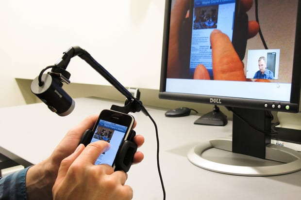
We’ve integrated our user research labs and field studies with a system that allows us to securely stream video of the user’s experience to our internal and client teams regardless of where they are in the world. This is a real-time feed and teams can talk, Slack, and/or whiteboard together while watching. Enabling teams to watch sessions for themselves has been the single biggest advancement toward our research creating real impact.
“Enabling teams to watch sessions for themselves has been the single biggest advancement toward our research creating real impact.”
Seattle24x7: Do you recommend online testing solutions such as Optimizely, Qualaroo, CrazyEgg, ClickHeat and others?
Franznick: Tools like these are a great way to get feedback when something is already in production. If that is the situation you are in, I think there are all sorts of tools like these you can use. Most of our clients are trying to learn what is wrong with a production site before it is too late. In most cases, it is better to move this effort forward into the design process so that the experience is right to at the moment you launch.
Seattle24x7: Eye-tracking studies resulting in visual heat maps that depict where attention is being concentrated on a Web page or screen seem to provide pinpoint accuracy. What findings have these studies yielded, in general, that can be applied to Web or landing page design? When and where is it best to deploy an

Franznick: Eye-tracking studies are an excellent way to understand what content on a screen is getting visual attention. There are some powerful visualizations that can be created with this data. One of my favorites is a kind of reverse heat map that blacks-out the screen in question and only reveals the areas of a screen that get attention. This can often show a team that users have a
Seattle24x7: What features do users now come to expect on websites? Are there elements that have been shown to rank highest in terms of engagement and/or persuasion? Conversely, what are the classic turkeys, or biggest turn offs, that turn up in usability testing?
Franznick: This varies widely depending on the context. In E-commerce, for example, there are clearly features users expect such as displaying: Is the item in stock? How much is shipping? When will I receive it? What are the customer reviews? These features help support their decision-making process and can prevent a user from abandoning the experience and going to another site that offers these answers.
As for turkeys, the most common is asking a user to sign-up too early in the process.
Seattle24x7: What do you consider to be the most intuitive form of user interface? Text links? Iconography? Contextual menuing? Is immersion into virtual reality environments and gestures a step forward in user-interface design or a step backward?
Franznick: I believe conversational UI — such as chatbots and voice-enabled assistants — holds the potential to be the most intuitive kind of interface. Current voice recognition technologies, when coupled with OS-level AI, has the potential to anticipate a user’s intent before users may even be aware of it themselves.
VR and gesture
Seattle24x7: The trend toward minimalism, or the attempt to emphasize “content over chrome,” emerged as a reaction to bloated, or “maximalist,” UI design. Is the mantra for Usability design still K.I.S.S. (Keep it Simple Stupid) or as Usability expert Steve Krug wrote, “Don’t Make Me Think”?
“Conversational UI — such as chatbots and voice-enabled assistants — holds the potential to be the most intuitive kind of interface.”
Franznick: I think the real mantra is actually “mobile first”. Bloated screens simply aren’t effective in a mobile experience on a number of levels. The widespread adoption of mobile devices (and Google’s algorithms) has helped the design community prioritize simplicity in a major way.
Seattle24x7: A pivotal issue on the Web these days is anonymity versus user privacy? How much information are users comfortable in submitting online, and what do they really not like providing?
Franznick: The age-old wisdom here is that users think about a value exchange between the anonymity they are giving up when filling out a form and what they are receiving in exchange. While I think this holds true for online forms, it gets more complicated when the data collected is behavioral in nature.
It is hard for the average user to think about a profile being built from the content they read, products they purchase, comments they up-voted, etc. Harder still is what can be done with that data.
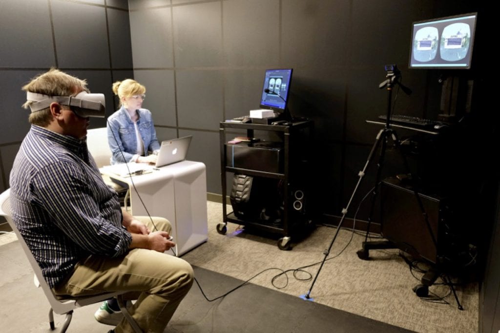
Seattle24x7: You’ve mentioned VR or Virtual Reality? How is UX testing different for the new, immersive digital worlds of VR/AR or MR?
Franznick: VR presents some really exciting new challenges for user experience professionals. This is where many innovative things are happening right now. Individual experiences in VR allow designers to re-write the rules of how
We are doing some really interesting work prototyping experiences in VR before we build real word prototypes for certain products. Architects and car designers have used VR for a long time to let users view styles and walk-through or around a new design. VR technology has advanced to the point that we can go beyond simply viewing an object and now start to virtually interact with it. This allows us to prototype and test the UX of a digital product or new service design experience in a matter of days, not months.
Seattle24x7: Does AI have a role to play in designing or testing UI/UX?

Franznick: There are some interesting advances in AI on the design side. The dream is to be able to user your voice to describe an experience and have an intelligent assistant design and code it for you instantly. We aren’t there yet, but I’ve seen some interesting demos of systems that let you sketch a UI and these sketches are recognized and transformed in to actual UI widgets and prototypes. There are clear design patterns for certain things like e-commerce sites for example, so I think the idea of them being created by an AI is not far off. I’m more excited by the idea of using AI to make small changes in a UI and then monitor performance of each variation. This could allow a future UI to evolve itself and improve over time.
Seattle24x7: Before we exit this interview, let me ask you about Exit Surveys that appear when a user is leaving a Website. Are they prime opportunities to gather feedback on a user?
Franznick: While better than nothing, these
Visit the Blink Website for more info on UX/UI.
Visit the Kelly Franznick blog and news site for more insights.


